Ya know, I've been thinking lately that my portfolio is weaksauce. Maybe not weak, but... it could be better (couldn't everything?).
So I've been mulling this idea in my head of something to help keep my creative juices flowing. Because sitting here isn't getting it done. I want to create something that will provide potentially infinite possibilities for side projects to help pad my portfolio. What I'm about to detail is my idea for
The Ideator.
I'll let that sink in for a second. Or at least leave you in suspense.
The Ideator would be a Flash-based application (because Flash is what I know best) that would generate design projects from a few lists of criteria. For example, the general format may be something like,
"Create a logo for a ___________ business. It must be ___________ and ___________."
Possibilities could include a logo for a plumbing business that must be a logotype/wordmark and in the International Typographic Design style. Or a logo for a postal courier in the Bauhaus style that appeals to millennials... I dunno...
They wouldn't all make sense, but they wouldn't necessarily need to. It would really be an exercise in creative thinking and problem solving; finding unique solutions to difficult design problems. Some cool things would definitely come out of it. And they wouldn't be limited to logos; it could include entire marketing campaigns.
One of the biggest things driving me to this idea is the fact that you very rarely get to choose your clients. If I want to bolster my portfolio, why should I limit myself by only showcasing my abilities on projects I'm interested in? There should be some combination that has me designing a poster for a Twilight convention.
I loathe Twilight.
But that's all the more reason to include it among the possibilities The Ideator could produce. It would prepare me (or any designer) to work on projects they may not be interested in, or even outright hate.
Right now, it's just in sketching/planning. But I really think this should happen.
Sunday, May 12, 2013
Thursday, December 13, 2012
Branding Poker Hands: 2-7 Offsuit

By far, the hand I was most excited to brand, which is amazing considering just how god awful of a starting hand this is. I personally refer to 2-7 offsuit as "Good Ol' 169" because, out of 169 possible starting hands, this hand ranks #169.
But that made it all the more interesting for design. Right away, I thought of making it look like a worn poorly designed logo — perhaps looking like it wasn't designed at all.
The 2 and 7 are rendered in Helvetica Bold. The spade, heart, diamond, and club icons are from Zapf Dingbats. I split the suit icons and combined them haphazardly, I separated the 2 and 7 so that it wouldn't read "27," and I made sure that no elements were on the same ground vertically. Actually, I didn't really "make sure" so much as I placed them and called it a composition. Turns out that the secret to making something look like it wasn't designed... is to not design it.
I added wear to the edges of all the shapes and a worn texture over top using blurring and sharpening (using Cameron Moll's tutorial here: http://cameronmoll.com/archives/000024.html). I rendered the 7 in red to further emphasize the cards being offsuit.
And that's it. I mean, this is the secondhand shop that takes the clothes Goodwill rejects. This is the number stenciled on the side of the house in a trashy neighborhood. Coincidentally, the club top on the diamond bottom resembles an ice cream cone, and the heart top on the spade bottom resembles a butterfly. On a stand (?). Which is fine — it represents the rare instance in which this starting hand actually pans out into a winner.
(If you play this hand and win, prepare to be heckled. With good reason.)
Completely inverse to the actual value of the hand, I really like how it turned out. Its poor design represents just how worthless the hand is. Which makes it good design. Kinda.
In the same breath, just like you shouldn't play 2-7 offsuit like a winner, I probably should be doing intentionally bad design and calling it good. ;-)
Branding Poker Hands: Doyle Brunson
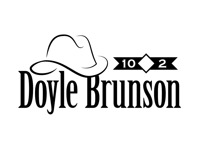
Doyle Brunson is perhaps the best known American poker player in the country. One of the icons of Texas Hold 'Em, Brunson famously won the World Series of Poker Main Event in consecutive years with the same starting hand: 10-2 offsuit.
In creating a logo representing him, I thought immediately of the cowboy hat he is wearing every time he is seen. I rendered a stylized cowboy hat using three strokes and varied the width to give it depth. The B in Brunson disappears behind the brim of the hat, further alluding to its depth.
The type is Birch Standard, as it had the elongated forms that put me in mind of the Old West, but with a slight elegance that seemed fitting in a Vegas poker room.
The graphic ribbon to the right includes the numbers 10 and 2, representative of his namesake hand, separated by a diamond. The shapes of these graphics echo the glyphic serifs in the type. The numbers are in Copperplate Bold, which is a typeface I usually shudder to use. But it is also a glyphic typeface, which may be why I don't mind it here.
Branding Poker Hands: Hockey Sticks

Another logo designed for the name, "hockey sticks" is a term given for pocket 7s because, well, the resemble hockey sticks. Upside down.
My plan was to design this logo in the style of a sports logo — not necessarily for a professional team so much as for a local or minor team. The 7s are Helvetica Neue Bold as the 7s seemed to work best for what I sketched out initially. I rotated them 180 degrees and turned them into a mask. Within the mask, I drew out the tape for the handle and the face of the stick. Without masking, it would have proven difficult to get the tape to line up exactly with the edge of the 7.
Many sports teams employ a circle or ring in their logo with type around the circle. I chose blue for the ring as it complimented the brown of the hockey sticks.
After browsing a number of typefaces I settled on Agency, widely kerned. for the "hockey sticks" typeface. It seemed to fit the best for the application.
Branding Poker Hands: Dead Man's Hand

Legend has it that the Dead Man's Hand is the poker hand held by "Wild Bill" Hickok at the time of his murder. It included the black aces and black eights. Those are shown above in the two As and 8s inside the red curly braces.
The fifth card Hickok was holding is unknown. Some claim it was the queen of hearts, others claim it was the 5 or 9 of diamonds. The bullet hole in place of a card represents both the mystery and Hickok's assassination, the red line extending from the hole representing blood.
Branding Poker Hands: The Death Card

"The Ace of Spades! The Ace of Spades! If you like to gamble, I tell you I'm your man!..."
Alright, enough of that.
This is my design for the ace of spades, otherwise known as the Death Card. I designed it strictly by name and the design of the card itself. The ace of spades features a large spade in the middle of the card, so that features in the logo. I made the letter A in DEATH larger, A obviously standing for "Ace."
I chose the Didot typeface for its Modern elegant feel. It is a type that, to me, seems straight to the point — so it is with death. I wanted the association with elegance because the large spade on the card itself is, generally, an ornately designed. I did not include any ornate elements here as I thought the notion of death is straightforward and not ornamented at all. I did apply a texture to the spade so it would look a little rougher, but not to the edges; I thought those should remain sharp.
Branding Playing Cards: Deviation
I plan on pursuing that project of creating a design for every card in the deck.
However, I started branding poker hands, and those ideas seemed to flow better. I'm going to begin posting those and the thought process behind them.
So far I have Doyle Brunson (10-2), Hockey Sticks (pocket 7s), 2-7 offsuit, the Dead Man's Hand (aces and eights), and The Death Card (the ace of spades). I will definitely be doing ducks (pocket 2s) and fishhooks (pocket jacks). After that, who knows?
Subscribe to:
Posts (Atom)